
July 23, 2026
Two-tone kitchen cabinets in Washington DC: design guide (2026)
How to specify a two-tone kitchen cabinet program in Washington DC, white upper and dark lower, contrasting island, color combinations that work, and what DC kitchens are building in 2026.
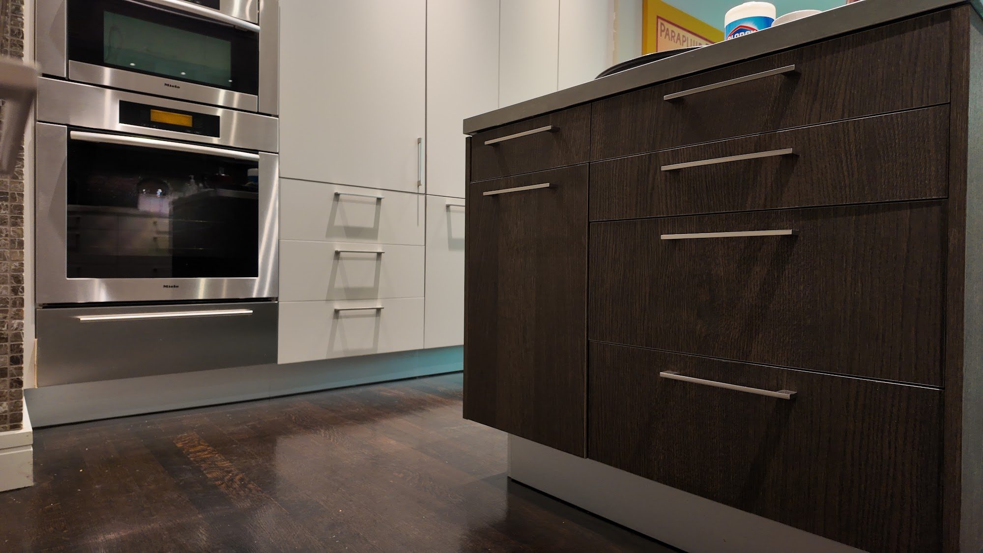
The all-white kitchen has dominated DC renovation programs for fifteen years. It works: it is clean, it photographs well, it suits almost any countertop material. But it does not distinguish itself. A kitchen in two tones does. The contrasting island, the dark lower against a light upper, the bold color cabinet in an otherwise neutral room: these are kitchens that a visitor remembers.
The two-tone kitchen program is now the standard specification at the upper end of the DC custom kitchen market, and it has migrated down from the design-forward programs of 2020 to mainstream renovation decisions in McLean, Bethesda, and Georgetown in 2026. The question is no longer whether to do two-tone but how to execute it correctly.
The three two-tone formats
Contrasting island
The most common two-tone program in DC: white or off-white perimeter cabinetry, contrasting island. The island is in a darker or bolder color (charcoal, navy, forest green, deep sage), with the same matte lacquer finish and same door profile as the perimeter. The result is an island that reads as the kitchen’s anchor, a visual center that is heavier and more deliberate than the surrounding cabinetry.
This format works in almost any kitchen with an island because the contrast is bounded: it does not overwhelm a smaller kitchen the way an all-dark program might. It is the entry point for clients who want two-tone but are not ready to commit to color across the full room.
Current DC specifications: White perimeter (Benjamin Moore White Dove or Chantilly Lace) with a charcoal island (Benjamin Moore Kendall Charcoal) is the most common combination. Navy (Hale Navy or Newburyport Blue) is the second most common island color. Forest green (Black Forest Green or Courtyard) has been growing since 2023 and is now firmly mainstream.
Dark lower, light upper
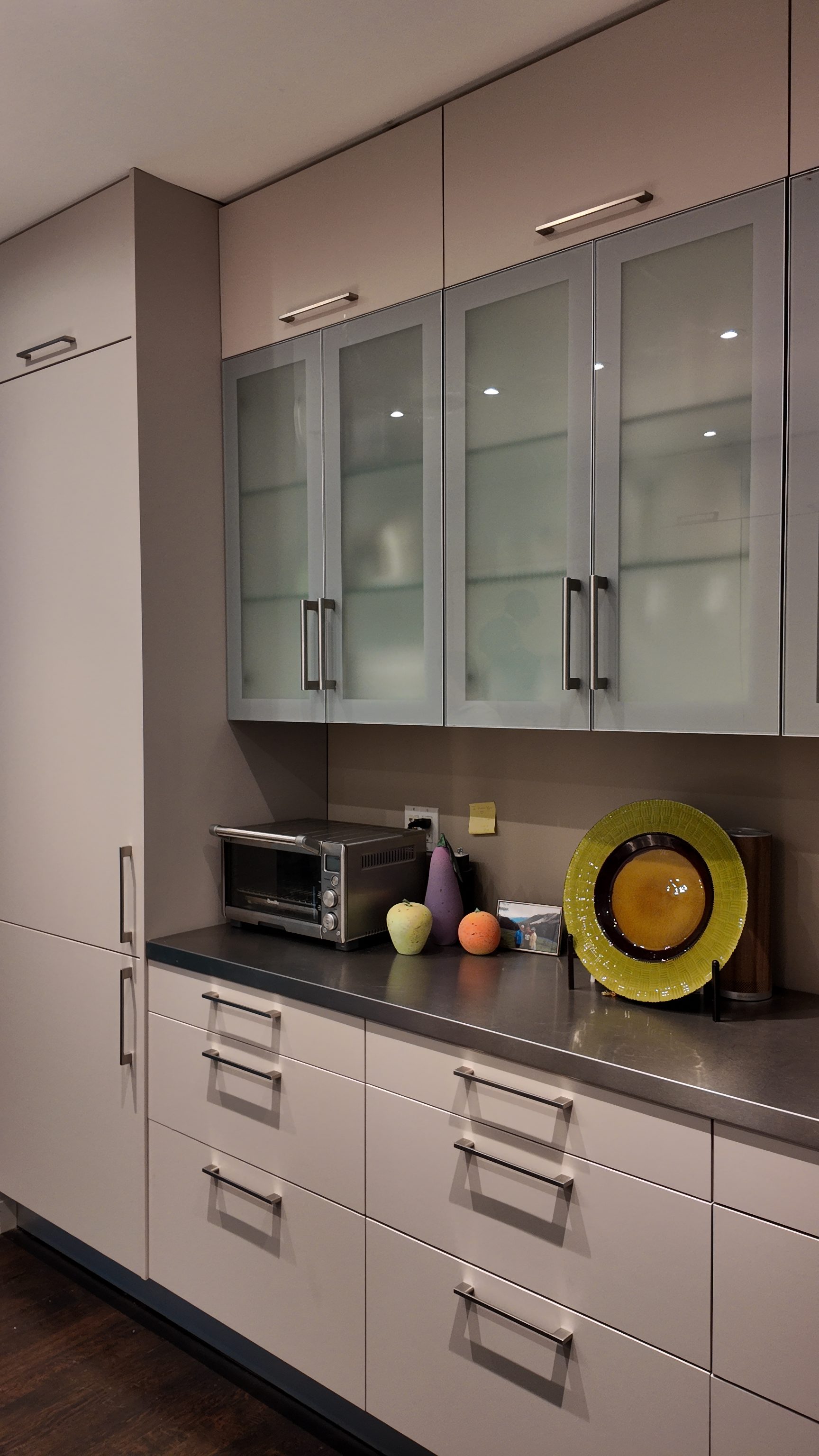
Upper cabinets in white or a light neutral; lower base cabinets in a darker color. The horizontal break (at approximately 54 inches, where the upper cabinets begin) creates a color division that references traditional wainscoting and feels intentional rather than arbitrary.
This format works best in kitchens with 9-foot or higher ceilings. At 8-foot ceilings, the dark lower cabinets can make the room feel lower. At 9 feet, the white uppers draw the eye up and the room reads as tall despite the contrast below.
The lowers-only two-tone is a bolder commitment than the contrasting island because the dark color is on the perimeter of the kitchen: surrounding the occupant rather than isolated at the island. It reads as a more designed decision and requires more confidence in the color selection.
Full-color program with a single neutral accent
All cabinets in a single bold color (deep sage, navy, charcoal, forest green), with one section in a contrasting neutral: typically the range hood surround, a pantry wall, or a display section in white or natural wood. The neutral accent gives the eye a resting point without breaking the dominant color program.
This is the most committed two-tone format and the one that produces the most distinctive results. A full navy kitchen with a white oak hood and open shelving section reads as a considered design decision that catalog programs cannot replicate.
Color combinations that work in DC
| Primary (perimeter or dominant) | Accent (island or lower) | Hardware | Countertop |
|---|---|---|---|
| White lacquer | Charcoal / Kendall Charcoal | Unlacquered brass | Calacatta quartz |
| White lacquer | Navy / Hale Navy | Unlacquered brass | Quartz or quartzite |
| White lacquer | Forest green | Unlacquered brass | White quartz or marble |
| Off-white / cream | Deep sage | Satin brass | Soapstone or honed granite |
| White lacquer | White oak veneer | Unlacquered brass | Quartzite |
| Charcoal lower | White upper | Matte black | Concrete-look Dekton |
The rule: The two colors should be separated by enough contrast to read as intentional: not as two shades of the same color that are slightly different. A white upper and a greige lower reads as indecision. A white upper and a charcoal lower reads as design.
What stays consistent between the two tones
For a two-tone program to read as a single designed kitchen rather than two separate decisions, three elements must be consistent across both colors:
Door profile: The same door profile (slab, shaker, or beaded), on every cabinet in the kitchen. Two different door profiles in two different colors reads as two kitchens in the same room.
Hardware: One hardware finish throughout, regardless of which cabinet color it is mounted on. Unlacquered brass on both the white perimeter and the dark island. Switching hardware finish between the two colors compounds the contrast in a way that reads as confusion rather than design.
Countertop: In most two-tone programs, a single countertop material runs throughout: perimeter and island. A countertop change at the island (for example, quartzite island, Dekton perimeter) is an additional design decision that works when it is intentional and reads as too much when it is not. If the countertop material changes between perimeter and island, the two-tone cabinet program should be simpler, not more complex.
The most common mistakes
Choosing colors that are too similar. If the two cabinet colors are not clearly distinct at normal viewing distance (from across the room, from the adjacent dining area), the two-tone reads as a mistake rather than a decision. Test the two colors side by side on full-size door samples before confirming the specification.
Dark island with dark countertop. A charcoal island with a dark Dekton countertop and dark hardware is a visually heavy combination that requires careful handling. The island counter should provide contrast to the island cabinet: light stone on a dark island reads correctly; dark stone on a dark island requires very specific conditions (high ceilings, very light perimeter) to avoid reading as a hole in the room.
Inconsistent door profiles. Specifying slab doors on the perimeter and shaker doors on the island, or vice versa, to “distinguish” the two zones is a mistake. The distinction comes from color; the door profile provides the room’s visual consistency.
Two-tone in DC’s housing contexts
Georgetown rowhouses: The dark island in a white perimeter is the two-tone format most suited to a Georgetown rowhouse kitchen. The island is a discrete element in a kitchen that may be 180 square feet or less; the dark color gives it visual presence without overwhelming the room. Full dark lower cabinets in a Georgetown rowhouse kitchen that is narrow (under 10 feet wide) can read as too heavy: the contrasting island is the right scale.
McLean and Bethesda colonials: At 250 to 350 square feet of kitchen space, all three two-tone formats work. The dark lower / white upper format has more room to breathe at this scale, and the full-color program with a neutral accent is appropriate in the largest estate kitchens where a single color across 400 square feet of cabinetry creates enough visual impact.
Dupont and downtown condos: A contrasting island in a condo kitchen reads well even at smaller scale, provided the island has adequate clearance. In a condo kitchen without an island, a dark lower with white upper on the perimeter can animate a simple galley program.
Frequently asked questions
Does a two-tone kitchen hurt resale value?
No: in the DC market at this price point, a well-executed two-tone kitchen is a selling point, not a liability. The color must be well-chosen and correctly specified, but the same is true of any design decision. A navy island with unlacquered brass hardware and Calacatta quartz is not a polarizing choice; it is a designed kitchen that appeals to the buyer profile that purchases $1.5M+ DC homes.
Can I do two different finishes, lacquer and veneer, as the two tones?
Yes. A white lacquer perimeter with a white oak veneer island is one of the most refined two-tone programs in the current DC market. The distinction is material rather than color, both tones are in the warm-neutral register, and the result reads as rich and considered. Hardware in unlacquered brass, countertop in quartzite or Calacatta marble.
How do I choose between the contrasting island and the dark lower / white upper?
The contrasting island is more contained and more forgiving: the dark color is on a single discrete element. The dark lower / white upper is a larger commitment that has more impact in a larger room. If your kitchen is under 200 square feet, start with the contrasting island. If it is 250 square feet or more with 9-foot ceilings, the dark lower / white upper is the stronger specification.
Does Pannello provide color mockups before fabrication?
Yes. Pannello produces a 3D visualization of the finished kitchen, with the actual specified colors and countertop material, before any panel is cut. The two-tone combination is reviewed and approved in 3D before fabrication begins.
To discuss a two-tone kitchen program: schedule a design consultation at our Georgetown showroom at 2201 Wisconsin Ave NW.
Related reading: Custom kitchen cabinets in Washington DC, 2026 guide · Cabinet hardware in Washington DC, 2026 guide · Kitchen island design in Washington DC, 2026 guide.